Themes
A theme re-skins every component in the gallery at once. Installable themes can also go into your own project: copy the agent prompt into your coding agent, or have it call get_theme on the Vital Agentic UI MCP server.
Kyndryl Shidoka
Kyndryl's Shidoka design system: TWK Everett headings, Roboto body, spruce actions, warm-red brand.
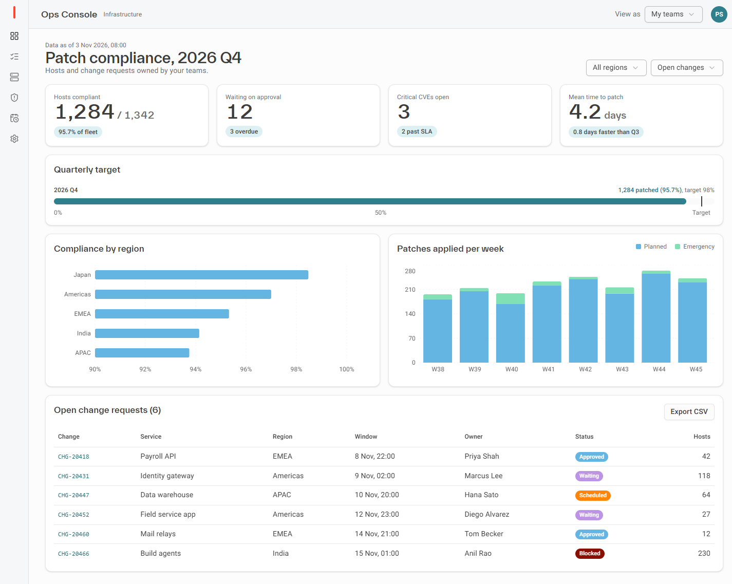
Light
Dark
Shidoka Internal
InstallableInternal toolsDashboardsData-dense admin pagesShidoka tuned for internal tools: Cloud cream page, borderless white cards on a soft elevation, spruce actions, TWK Everett headings over dense 14px Roboto, and a coal dark mode.
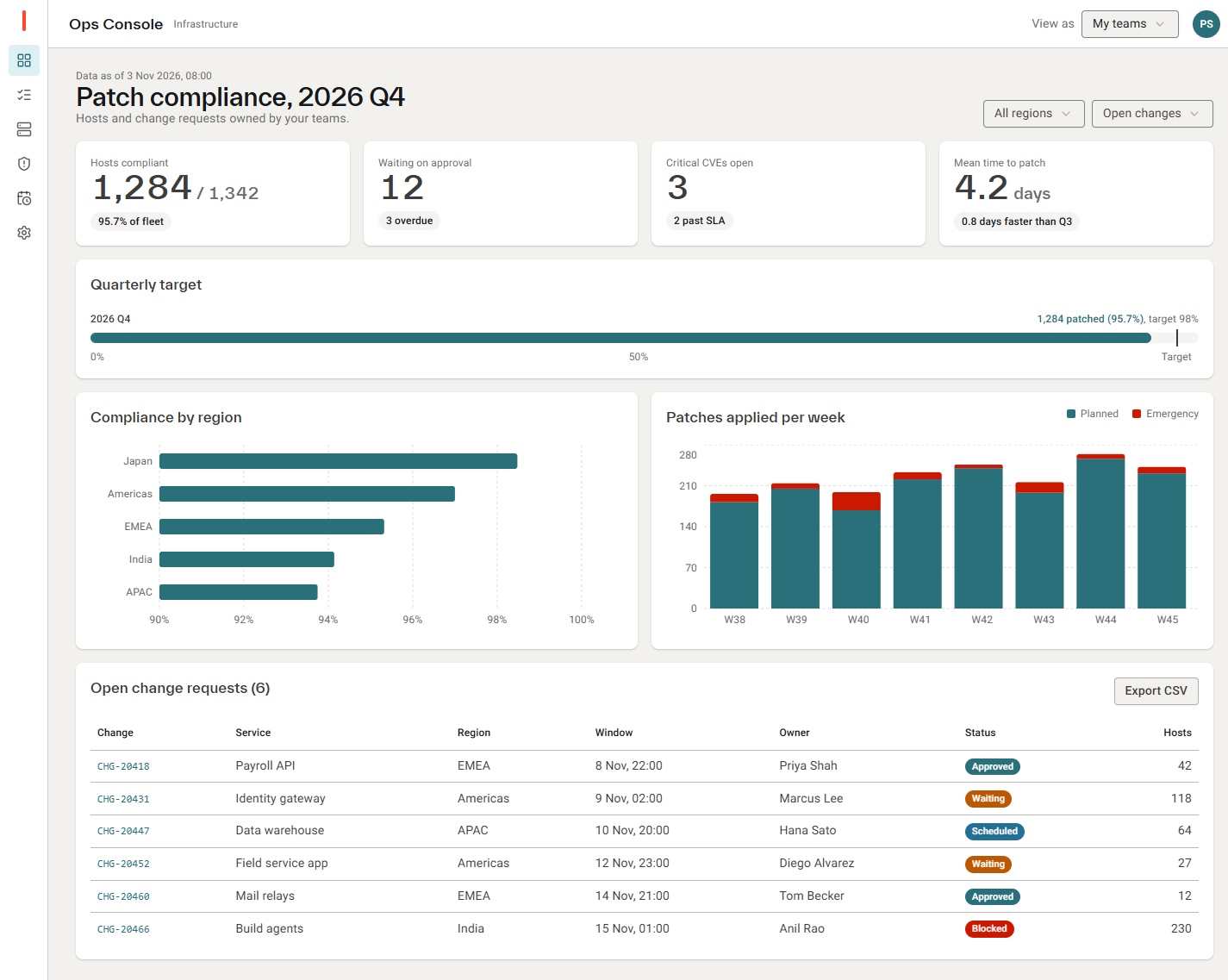
Light
Dark
Use it in your project
Paste the agent prompt into your coding agent. It covers both routes below, the packages to install and the rules for building screens in this theme.
With the MCP server, the agent calls
With the shadcn CLI
Read the agent prompt
Apply the "Shidoka Internal" theme from the Vital Agentic UI registry to this project. Kyndryl Shidoka tuned for internal tools: Cloud cream page, borderless white cards on a soft elevation, spruce actions, TWK Everett headings over dense 14px Roboto, and a coal dark mode.

Get the theme in one of two ways:
- MCP: if the vaui MCP server is connected, call get_theme with id "shidoka-internal". It returns the css, install command, setup steps and these rules.
- shadcn CLI: npx shadcn@latest add https://<hub>/r/themes/shidoka-internal.json

Then:
1. Install the packages with the project's package manager: npm install @kyndryl-design-system/shidoka-foundation @fontsource/roboto
2. Import "@kyndryl-design-system/shidoka-foundation/css/root.css" before your global stylesheet. It defines every --kd-color-* token this theme references and loads TWK Everett and Roboto Mono.
3. Import Roboto 400, 500 and 700 ("@fontsource/roboto/400.css", "/500.css", "/700.css") in the root layout.
4. Dark mode is the .dark class on <html>, as in any shadcn project.

Follow these rules for every screen you build or restyle:

# Shidoka Internal: applying the theme

This theme is Kyndryl Shidoka applied for internal tools: dashboards, queues, admin pages and reports that people read all day. It assumes a React project with Tailwind CSS v4 and shadcn/ui-style components (they read `--background`, `--primary` and the other shadcn variables).

## Install

1. Add the CSS. Pick one of these:
   - From the Vital Agentic UI MCP server, call `get_theme` with `shidoka-internal`. Paste its `css` into the global stylesheet.
   - With the shadcn CLI, run `npx shadcn@latest add <hub>/r/themes/shidoka-internal.json`.
2. Replace the project's existing `:root` and `.dark` variable blocks with the theme's blocks. Merge its `@theme inline` entries into the existing `@theme inline`. Keep its rules.
3. Install the packages listed under `dependencies` and do the `setup` steps. The `--kd-color-*` tokens and TWK Everett come from the Shidoka foundation stylesheet, which must load before the global stylesheet.
4. Check one screen in light mode and in dark mode (the `.dark` class on `<html>`) before restyling anything else.

## Surfaces

- The page is `bg-background`: Cloud cream in light mode, coal in dark mode. Content sits on white cards. Only the page title row sits directly on the page.
- Cards have no border. They are separated by the elevation shadow (`shadow-card`) and an 8px radius; the theme applies both to every `data-slot="card"`. Do not add `border` classes to cards, and do not nest cards inside cards.
- Inside a card, use `bg-muted` or `bg-tile` for a secondary tile, such as a stat inside a chart card.
- `border-border` (30% ink) is for dividers, table rows and input outlines only.

## Colour

- Spruce (`bg-primary`, `text-link`) is the one action colour. It covers primary buttons, the selected tab or nav item, links and focus rings.
- Kyndryl warm red (`bg-brand`) is only for the brand mark, such as a logo bar. Never use it for buttons, errors or chart emphasis.
- Errors use `bg-destructive` for fills and `text-destructive-text` for messages.
- Charts use series colours in order, `chart-1` to `chart-5`: spruce, warm red, sea, lilac, amber. They are the same in both modes. Labels on filled marks are white.
- A status pill is a solid series colour with white 11px medium text, fully rounded. Give each status one series colour and keep it on every screen.
- Never write hex values. Every colour comes from a token, and every token comes from Shidoka (`--kd-color-*`).

## Type

- Headings use TWK Everett (`font-heading`) at weight 500:
  - The page title (`h1`) is 28px with line-height 1.15 and -0.01em tracking.
  - Card titles (`h2`/`h3`) are 16 to 18px.
- Body text is Roboto 14px (`text-sm`), line-height 1.5. Captions and meta text are 12px `text-muted-foreground`.
- KPI figures are TWK Everett 36px, weight 500, with tabular numbers. A short label sits above the figure and a pill below it.
- IDs, dates and codes use `font-mono` at 12px. Colour them `text-link` when they navigate.
- Use weights 400, 500 and 700 only. Use `font-medium`, not `font-semibold`: Roboto has no 600.

## Density and shape

- Controls are 32px tall (`h-8`) with a 4px radius (`rounded-md` under this theme). Cards have an 8px radius.
- Inputs and selects are filled (`bg-field`, `bg-field-hover` on hover) with a cool-grey outline. The theme styles shadcn inputs, textareas and select triggers this way.
- Tables:
  - Header cells are 12px `font-medium text-heading`, and body cells use `py-2`.
  - Rows are separated by `border-border`, with no zebra stripes.
  - Numbers are right-aligned.
- Spacing sits on a 4px grid. Cards use 16px padding (`p-4`) and 16px gaps between them. Content is left-aligned, up to about 1500px wide.

## Focus, motion and dark mode

- Focus is a 2px ring-coloured outline with a 2px offset. Never remove an outline without a visible replacement.
- Solid buttons drop to 90% opacity on hover. Transitions are 150ms. Keep page motion to purposeful changes: opening, expanding, confirming.
- Dark mode is coal:
  - The page is interactive-110, cards are interactive-107 and the sidebar is interactive-115.
  - Text is stone-10.
  - Spruce stays the action colour; links and focus rings lighten to spruce-20.
  - Do not invert images or charts.

## Avoid

- Gradients, glows, coloured shadows and glassmorphism.
- Borders around cards, and cards inside cards.
- Warm red anywhere other than the brand mark.
- Tracked-out uppercase labels above every section.
- New colours or font sizes outside these tokens and sizes.
Agentic Console
InstallableClient demosAgent-first productsOperations appsA calm operations console for agent-first products: warm off-white canvas, white cards on a soft shadow, near-black ink actions, pill buttons, Inter with JetBrains Mono ids, and an indigo accent reserved for the agent. Brand-neutral, so a client colour drops into --brand or --primary.
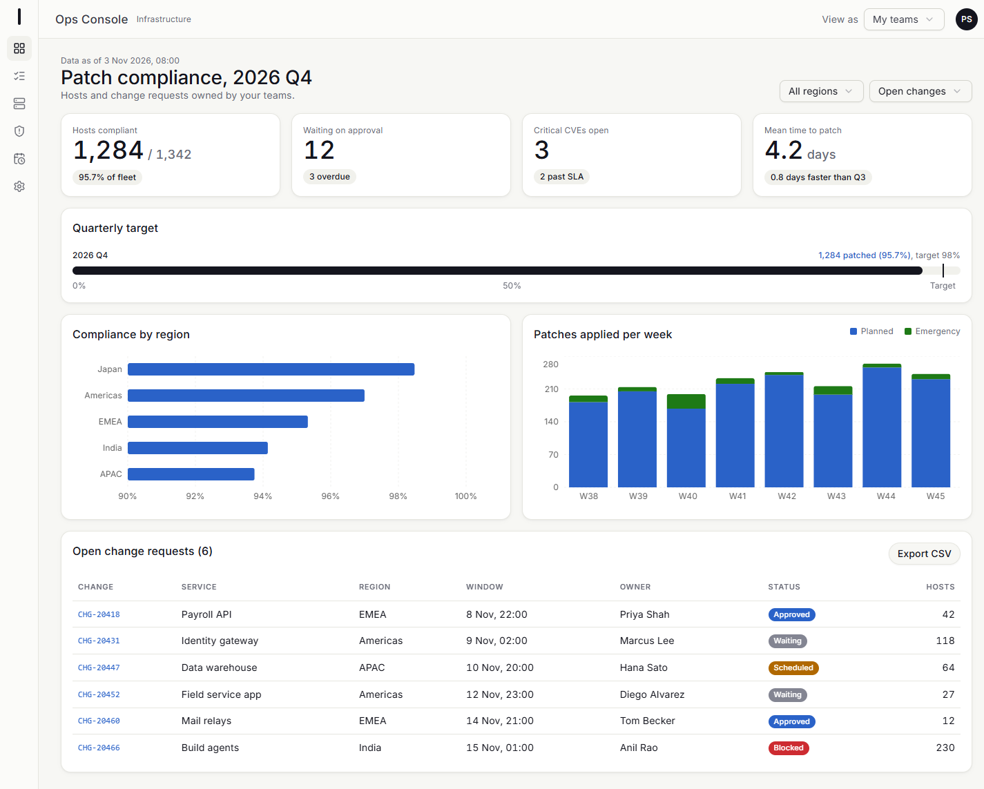
Light
Dark
Use it in your project
Paste the agent prompt into your coding agent. It covers both routes below, the packages to install and the rules for building screens in this theme.
With the MCP server, the agent calls
With the shadcn CLI
Read the agent prompt
Apply the "Agentic Console" theme from the Vital Agentic UI registry to this project. A calm operations console for agent-first products: warm off-white canvas, white cards on a soft shadow, near-black ink as the action colour, pill buttons, Inter over dense 14/22 body text with JetBrains Mono ids, an indigo accent reserved for the agent, and a deep blue-black dark mode. Brand-neutral, so a client colour can go into --brand or --primary.

Get the theme in one of two ways:
- MCP: if the vaui MCP server is connected, call get_theme with id "agentic-console". It returns the css, install command, setup steps and these rules.
- shadcn CLI: npx shadcn@latest add https://<hub>/r/themes/agentic-console.json

Then:
1. Install the packages with the project's package manager: npm install @fontsource-variable/inter @fontsource/jetbrains-mono
2. Import "@fontsource-variable/inter" once in the root layout or global stylesheet. It registers the "Inter Variable" family that font-sans and font-heading name.
3. Import "@fontsource/jetbrains-mono/400.css" and "@fontsource/jetbrains-mono/500.css" in the same place. font-mono uses them for ids, codes and timestamps.
4. Dark mode is the .dark class on <html>, as in any shadcn project.

Follow these rules for every screen you build or restyle:

# Agentic Console: applying the theme

This theme is for operations apps where people and an AI agent work the same queue. It covers task inboxes, ticket pages, approvals and status dashboards, and it suits client demos. It has no client branding: the action colour is ink, so a client's brand colour can go into `--brand`, or `--primary` if they want coloured buttons. It assumes a React project with Tailwind CSS v4 and shadcn/ui-style components, which read `--background`, `--primary` and the other shadcn variables.

## Install

1. Add the CSS. Pick one of these:
   - From the Vital Agentic UI MCP server, call `get_theme` with `agentic-console`. Paste its `css` into the global stylesheet.
   - With the shadcn CLI, run `npx shadcn@latest add <hub>/r/themes/agentic-console.json`.
2. Replace the project's `:root` and `.dark` variable blocks with the theme's. Merge its `@theme inline` entries into the existing `@theme inline`, and keep its rules.
3. Install `@fontsource-variable/inter` and `@fontsource/jetbrains-mono`, then do the `setup` steps (the font imports).
4. Check one screen in light mode and one in dark mode (the `.dark` class on `<html>`) before you restyle anything else.

## Surfaces

- The page is `bg-background`, a warm off-white in light mode and blue-black in dark mode. Content sits on white cards (`bg-card`). Only the page title row and the breadcrumb sit directly on the page.
- Cards have a 1px `border-border` and the soft `shadow-card`. The theme applies both to every `data-slot="card"`. Do not add heavier shadows, and do not nest cards inside cards.
- Inside a card, use `bg-muted` for a recessed tile, such as a stat, a callout or a group header. Use `bg-accent` for hover and selected rows.
- Popovers, menus, dialogs and sheets use `shadow-pop`, which the theme applies. Nothing else floats.
- Dividers, table rows and outlines use `border-border`. Inputs use `border-input` on a white field, which the theme also applies.

## Colour

- Ink (`bg-primary`, near-black in light mode and near-white in dark mode) is the one action colour. Use it for primary buttons, the selected nav item, the selected-row bar and links that need emphasis. Never use it for status.
- Status has its own tones. Each is an 8% tint with full-strength text and a 20% inset ring (`bg-success/8 text-success ring-1 ring-inset ring-success/20`):
  - `info` (blue) means pending, new or scheduled.
  - `success` (green) means resolved, done or healthy.
  - `warning` (amber) means due soon or at risk.
  - `destructive` (red) means blocked, failed, overdue or high priority.
  - `conflict` (magenta) means two records or sources disagree.
  - Neutral is `bg-muted text-muted-foreground`.
  Give each status one tone and keep it on every screen. Prefer the Kyndryl `status-badge` component over hand-written pills.
- The agent accent (`text-agent`, `bg-agent`, indigo) marks only things the agent did, said or suggests: its messages, its panel, a step it owns, a "Suggested by agent" badge. Never use it for buttons, links or focus.
- `--brand` is a placeholder. It is ink until a client colour is dropped in. Use it only for a logo mark.
- Charts use `chart-1` to `chart-5` in order: blue, green, amber, magenta, slate. Use slate for "other" or "not started".
- Never write hex or rgb colours in components. Every colour comes from a token.

## Type

- Inter is the only text face (`font-sans`). JetBrains Mono (`font-mono`) is for ids, codes, timestamps and versions only, such as `CHG-1042`. Set mono ids at 12 to 13px, weight 500.
- Body text is 14/22 (`text-sm`), and this is the default size. The scale is 11, 12, 13, 15, 17 and 20px (`text-2xs`, `text-xs`, `text-[13px]`, `text-[15px]`, `text-[17px]`, `text-xl`).
- Page titles are 30 to 36px, weight 600, with -0.025em tracking. Card titles are 15 to 17px, weight 600, with -0.01em tracking. Muted meta lines are 12px `text-muted-foreground`.
- KPI figures are large and light: 40px, weight 300, `tabular-nums`, with a 15px unit after them and a one-sentence footnote under them.
- The eyebrow (11px, weight 600, uppercase, 0.08em tracking, `text-muted-foreground`) is for one label above a title, such as a record id. Use it sparingly, not above every section.
- Use `tabular-nums` for every number that sits in a column or changes.

## Shape and density

- `--radius` is 10px, so `rounded-md` is 8px, `rounded-lg` 10px and `rounded-xl` 14px. Cards are `rounded-xl`. Tiles and inputs are `rounded-lg`.
- Buttons and badges are pills. The theme rounds every shadcn `data-slot="button"` and `data-slot="badge"`.
- Spacing is on a 4px grid. Cards use 20px padding (`p-5`) and 20 to 24px gaps. List rows use 12px vertical padding (`py-3`) and 20px side padding (`px-5`).
- Table headers are 11px, uppercase, weight 600 and muted, which the theme applies to `data-slot="table-head"`.

## Motion

- Use one easing everywhere: `ease-console` (`cubic-bezier(0.2, 0.7, 0.2, 1)`). Fades take 140ms, a page enters in 320ms, and a side panel opens on a spring (stiffness 380, damping 36). Selection indicators slide on a stiffer spring (500, 40).
- Motion confirms something happened: a panel opening, a step completing, a row being selected. Do not animate on scroll or loop decoration. Only live states pulse, such as an agent working or a step in progress.
- Respect `prefers-reduced-motion`. Use `useReducedMotion` from `motion/react`, or `motion-safe:` for CSS animation.

## Focus and dark mode

- Focus is a 2px ring-coloured outline with a 2px offset (the theme's base rule), or the shadcn `ring-ring/50` halo on controls. Never remove an outline without a visible replacement.
- In dark mode:
  - The canvas is 11 12 18, cards are 19 20 29 and popovers are one step lighter.
  - Text is near-white. Primary flips to near-white too, with dark text on it.
  - Status tones and the agent accent lighten so they keep their contrast.
  - Borders carry more of the separation than shadows. Do not invert images or charts.

## Avoid

- Gradients, glows, coloured shadows and glassmorphism.
- Coloured primary buttons, unless a client brand is deliberately dropped into `--primary`.
- The agent indigo on anything the agent did not do.
- More than one font family besides mono, and weights other than 300, 400, 500 and 600.
- Uppercase tracked labels above every section, and borders around cards that are already on a card.
Original (upstream defaults)
Each component exactly as its library ships it, on shadcn/ui's neutral palette.
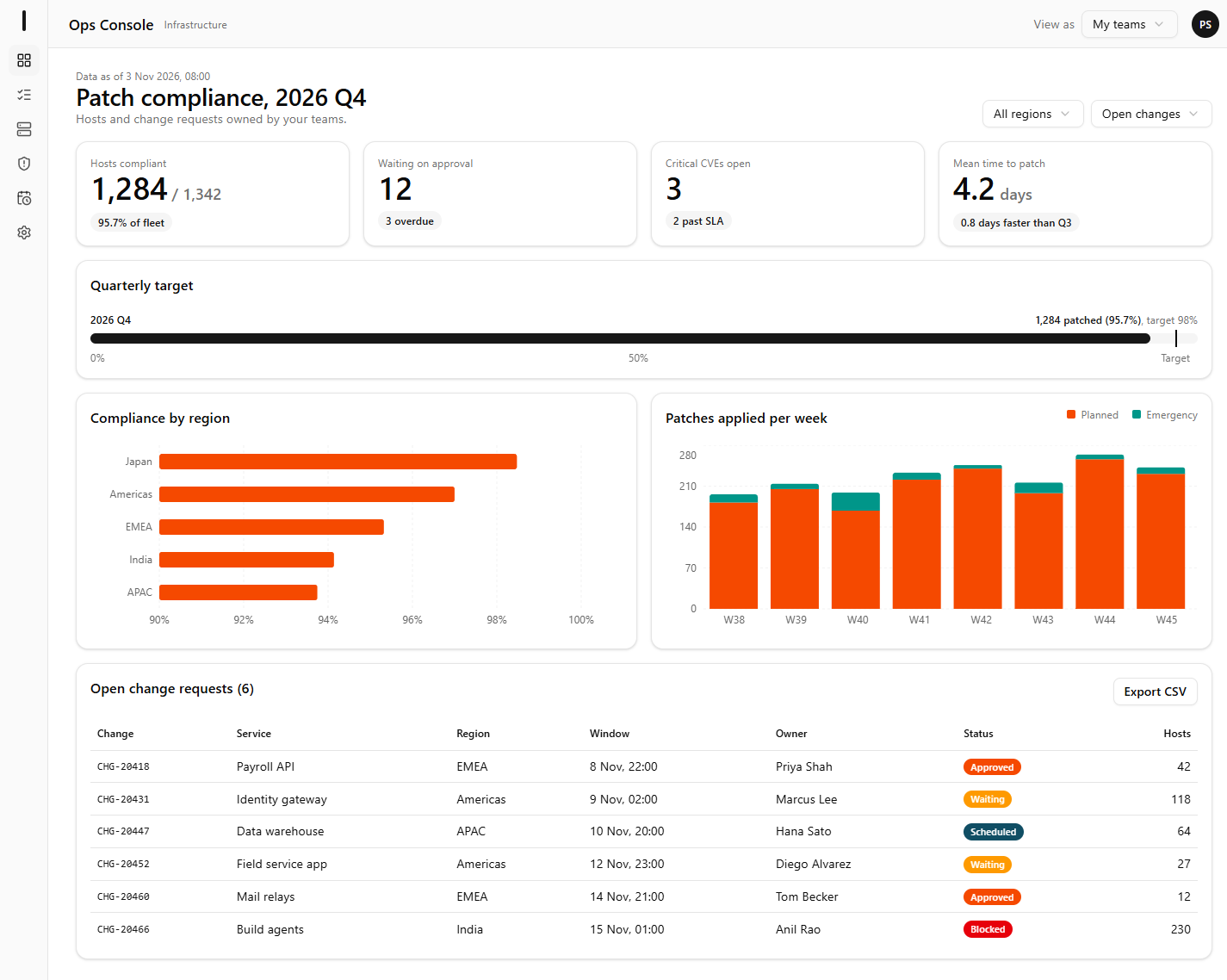
Light
Dark